Learn How to Design an Ad That Grabs Attention and Convince Customers in Saudi Arabia: Your 2026 Guide
How to Design an Ad That Converts in Saudi Arabia
In 2026, the competition for the Saudi customer’s attention has become fiercer than ever. Today, your customer spends hours every day across Snapchat, Instagram, TikTok, Google, and YouTube, with dozens of advertising messages passing in front of their eyes every single day.
Here’s the real question:
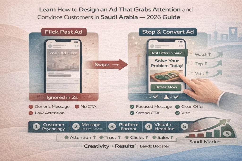
Is your ad one of those ads they flick past with their finger? Or is it one of the ads they stop at, watch until the end, and maybe even tap “Learn More” or “Order Now”?
That’s why learning how to design an ad that grabs attention and convinces customers in Saudi Arabia is no longer a luxury. It’s an essential skill for any business owner, marketing manager, or even freelancer who wants to prove themselves. Weak ads don’t work anymore; the customer is now more aware, sees hundreds of examples daily, and can clearly tell the difference between an “over-produced” ad and one that speaks their language, talks about their problem, and presents a clear solution.
On top of that.
The cost of paid advertising keeps increasing year after year, and every riyal wasted on a weak ad design is a missed opportunity handed to your competitor. Your ad is not just a picture or a video; it’s the “first handshake” between your brand and the customer. If this handshake is weak, it becomes very difficult to rebuild trust later. But if it’s strong, it often opens the door to a website visit, a social follow, or an engagement that later turns into a real customer.
In this guide, we’ll walk you step by step into the world of designing effective ads that fit the Saudi market: from understanding customer psychology, to crafting your message, then choosing the right visual format for each platform, all the way down to the small details like colors, headlines, and the call-to-action (CTA). And with Leadz Booster’s experience in producing videos and advertising campaigns, we’ll show you how to connect creativity with results—so your ad isn’t just “pretty,” but a real sales tool that serves your goals in 2026 and beyond.
What Do We Really Mean by “Designing a Successful Ad”? (More Than Just a Nice Look)
Before we talk about colors, fonts, and platforms, we need to understand what “designing a successful ad” actually means. A lot of people reduce the whole topic to “a neat poster” or “a nice video,” but an ad that truly works in the Saudi market has three core functions:
- It grabs attention quickly in the middle of all the content noise.
- It explains the idea or offer in a very simple way.
- It pushes the customer to take a clear next step (visit a website, contact via WhatsApp, book, buy…).
So, a successful ad design is a combination of: a strong message, a clearly defined audience, and a smart visual execution.
If the message is weak, no matter how professional the design looks, the ad will have no real impact.
If the message is strong but the visual design is messy, the customer won’t continue watching for more than a second or two.
And if both the message and design are excellent but there is no clear CTA, you lose the very moment when the customer was ready to act.
That’s why you need to think of the ad as a “mini-story” told in just a few seconds:
- A beginning that grabs attention (a problem, a familiar scene, a direct question to the customer).
- A middle that presents the solution (your product, your service, your edge).
- An ending with a clear invitation (try, order, book, contact…).
A successful ad design also has to respect the nature of each platform:
A Snapchat ad is not the same as an Instagram feed ad, which is not the same as a Story, and definitely not the same as a Google search ad. Every platform has its own display style, attention span, and different user expectations. What works perfectly for a young audience on Snapchat might not fit a company director searching on Google for “a specific service in Riyadh.”
In the rest of this article, we’ll break down the elements of a successful ad step by step and show you how to build an ad that fits the Saudi market. Then, starting from the fifth section, we’ll connect all of this with how you can work with a team like Leadz Booster—who has practical experience in designing video ads, social ads, and integrated campaigns that deliver real results, not just views.
The Foundation of Any Successful Ad Design: Know “Who Is Speaking” and “Who You’re Speaking To”
Before you open a design file or write your first word, ask yourself two simple questions that determine the fate of any ad design:
1) Who is speaking?
Meaning: who are you as a brand? Are you formal? Youthful? Premium? Budget-friendly? Do you compete on high quality or on best price?
Your tone of voice must appear clearly in the ad: the words, the colors, the type of visuals, even the way you phrase the call-to-action. A luxury brand cannot speak in the same way as a fun, youthful brand full of emojis and expressive icons.
2) Who are you speaking to?
Is your audience people in their twenties scrolling Snapchat and TikTok more than anything else? Or families looking for practical daily solutions? Or company executives who care about professional language, solid results, and numbers?
An ad designed for university students in Jeddah is completely different from an ad designed for factory owners in Riyadh or clinics in Dammam.
Once you define “who you are” and “who is in front of you,” the shape of the ad begins to become clear:
- Type of language: simple Modern Standard Arabic? Light Saudi dialect? A mix of both?
- Type of visuals: real people? Clean mockups? Product-only shots?
- Type of promise: comfort? Saving time? Increasing sales? Improving brand image?
It’s also important to understand the customer’s “state” when they see the ad:
Are they in entertainment mode (scrolling Snapchat at night)?
Or in search mode (typing into Google to find a solution to a specific problem)?
The same person can accept totally different messages depending on their state. A smart ad design respects this: in entertainment mode you focus more on the story and visuals; in search mode you focus more on information and a direct solution.
When you answer these questions clearly, you will have laid the foundation for any successful ad design: an ad that comes from a well-defined brand identity, aimed at a specific person, at a specific moment, with a specific goal.
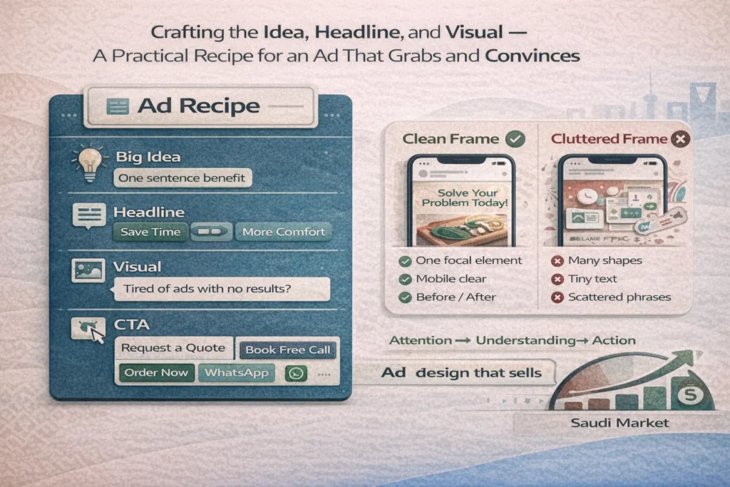
Crafting the Idea, Headline, and Visual… A Practical Recipe for an Ad That Grabs and Convinces
After you’ve defined your brand and your audience, it’s time for the “heart” of the ad design: the idea + the headline + the image/video.
First: The core idea (Big Idea)
Ask yourself: if I only had one sentence to say to the customer, what would it be?
Is it “We save you time”? “We double your store’s sales”? “We make your home smarter”?
The idea has to be simple, powerful, and built around a real benefit that touches the customer’s life—not just a technical description of the product.
Second: The headline
The headline is the first thing your customer reads, and usually they decide in less than a second whether to continue or scroll away. So try to make your headline:
- Clear and free of unnecessary complexity.
- Connected to a specific problem or desire, for example:
- “Tired of ad campaigns that don’t bring results?”
- “Your online store deserves an ad design that sells—not just collects views.”
Avoid very generic headlines like “The best marketing solutions,” because they don’t touch a specific situation and they don’t stick in the mind.
Third: The image or video
On social media especially, the eye reacts before the brain. A strong ad design starts with a visual (image or video shot) that:
- Shows the problem or result within seconds (before/after – chaos/organized – exhaustion/comfort…).
- Is clear on mobile, without cluttered small text.
- Uses colors and visual identity that are consistent with your brand.
Stick to the rule: “One strong focal element is better than ten distracting elements.”
A clear image + a simple headline + a direct CTA is much stronger than a design packed with shapes, fonts, and scattered phrases.
Fourth: The call-to-action (CTA)
Don’t forget the most important line in the ad:
What do you want the customer to do now?
- Request a quote
- Book a free consultation
- Sign up now
- Contact us on WhatsApp
The more specific and easy the call-to-action is, the higher the chance that the customer will actually move.
A successful ad design is the one that combines all of these elements in one clean, focused frame: a strong idea, a clear headline, a visual that “speaks,” and a CTA that turns attention into a real action.
How Does Leadz Booster Approach Ad Design From a “Results” Angle, Not Just a “Nice Look”?
In many cases, the business owner goes to a graphic designer and says: “I want a strong ad design,” and then gets back a poster that looks beautiful, with attractive colors and fancy fonts… but the ad generates no clicks, no inquiries, and no sales.
Why? Because the design was built from a purely “aesthetic” perspective rather than a “results” perspective.
This is where working with a team like Leadz Booster makes a real difference.
At Leadz Booster, we never start from the design software. We always start from a business question:
- What exactly is this ad supposed to achieve?
- More website visits?
- More WhatsApp inquiries?
- Selling a specific offer for an online store?
- Or building brand awareness in Riyadh or Jeddah?
The answer to this question is what defines the idea, the headline, the platform, and the length or format of the video/design.
We treat ad design as one part of a full campaign, not as a standalone image. That’s why we ask:
Where will this ad be placed? Snapchat? Instagram? TikTok? Google Display?
Every platform has its own format, size, and attention span.
The Leadz Booster team adjusts the ad so that it fits the behavior of the Saudi customer on each platform:
- On Snapchat: a quick shot, a strong start, and very simple copy.
- On Instagram: high-quality image/video, strong brand look, and a clear CTA.
- On TikTok: a short story or a skit that highlights a real problem.
We also connect the ad design with the landing page or service page on your website: same colors, same promise, same tone—so the customer feels that they’re just continuing the same experience, not jumping into a new world.
Instead of treating the design as a “final file,” we treat it as a component in a larger system:
We create multiple versions (different headlines, different visuals), monitor performance, and keep improving the winner. With this mindset, ad design with Leadz Booster moves from being just a creative exercise to becoming a calculated tool for attracting customers from the Saudi market and turning them into real leads and sales.
Leadz Booster’s Skills and Achievements in Ad Design: From Concept to Ready-to-Launch Video
What makes Leadz Booster stand out is that the team isn’t just “one designer,” but a combination of integrated expertise all serving a single goal: designing ads that attract, explain, and sell.
- It starts with the ad copywriters, who know how to turn your business idea into a simple message that hits the core of the problem:
- An opening line that touches the customer’s pain.
- A sentence that explains the benefit.
- And a CTA that nudges them to take action right now.
The copy comes out in a style that fits the Saudi market—not overly formal, and not exaggerated slang either. It’s a balanced tone that respects the brand while staying close to the customer’s mind and heart.
- Then comes the role of the design and video editing team, with experience in producing marketing videos, whiteboard animations, and social-first ad creatives.
Here, Leadz Booster’s passion for “story” rather than just “visuals” appears clearly:
Usually, the ad is built on a thought-out scenario—not just a random collection of clips.
Colors and fonts are chosen to match the brand identity, while keeping in mind that the ad will mostly be viewed on a small mobile screen—so it’s designed to be clear and understandable without zooming or extreme focus.
- On top of that, Leadz Booster leverages its strong background in campaign management: the team already knows how the platform behaves with different types of ads and what elements increase the chances of getting approved and performing well (view rate, click-through rate, and conversion).
This affects the way the ad is designed from the start: text size, presence of real footage, element layout, and even video length.
Most importantly, the team’s spirit—as reflected in the “About” page—is built on a love of experimentation and improvement. We’re not satisfied with an ad that just “looks nice”; we want to see numbers move: more visits, more clicks, and real messages and inquiries coming in for the business owner.
This passion for detail and results is what makes ad design with Leadz Booster a totally different experience from just ordering a design from some random source on the internet.
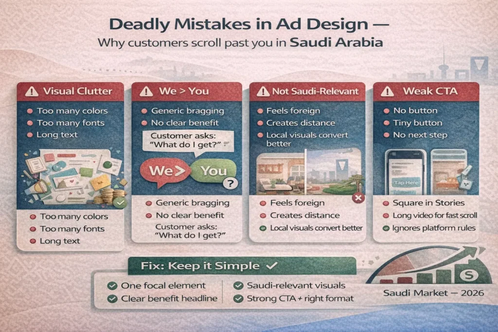
Deadly Mistakes in Ad Design… That Make the Customer Scroll Past You Like You Don’t Exist
Even if your idea is strong and your service is excellent, there are some common mistakes in ad design that can make all your effort vanish with no impact.
First mistake: visual clutter
Too many colors, too many fonts, long phrases, several logos…
The result? The Saudi customer’s eyes get overwhelmed in a second and they move on to the next ad.
In this age of speed, a successful ad is the one that communicates the idea with the fewest possible elements: a clear image, a strong headline, and a single sentence that explains the offer—with a clear call-to-action button.
Second mistake: talking about yourself more than the customer
Many ads are full of phrases like “We are the best,” “We have long experience,” “A leading company in the field”…
But in the customer’s mind, there is a simpler question:
“What do I get out of this?”
A smart ad design shifts the focus from “we” to “you”:
- “Double your store’s sales in 90 days.”
- “Reduce your ad campaign costs without reducing results.”
Third mistake: using visuals that don’t reflect the Saudi reality
For example, foreign stock photos that don’t match the customer’s environment, or scenes that don’t look like real life in the Kingdom. This creates an unconscious distance between the viewer and your ad.
On the other hand, visuals that reflect their environment (homes, streets, culture, clothing…) increase the feeling that the message is “speaking to them” specifically.
Fourth mistake: weak or hidden CTA
A beautiful ad, but with no “Order Now,” “Contact Us,” “Book Your Appointment,” or with a tiny call-to-action button buried inside the design.
The result: the customer likes the ad but doesn’t know the next step.
Fifth mistake: not adapting the ad to the platform
A cluttered square design placed in Stories.
Or a long video on a platform where the user scrolls quickly and has full control.
Every platform has its own unwritten rules, and an effective ad design respects those rules if you truly want to get results in Saudi Arabia.
Keep reading and uncover secrets that can change the way you work. How to Create a Successful Snapchat Ad in Saudi Arabia? Your 2026 Guide
From a Single Ad to a Learning Campaign… How to Turn Ad Design into a Continuous Process With Leadz Booster
The biggest mistake many people make with ad design is treating it as a “one-and-done” task:
“We design an ad, launch it, and if it works we continue—and if it doesn’t, we say ‘ads don’t work.’”
The right approach in 2026 is to treat each ad as a structured test that we learn from.
Here, the role of a team like Leadz Booster becomes critical—not just delivering a design file, but continuously linking the ad to real metrics and ongoing optimization.
At the beginning, we launch multiple versions of the same ad:
- Different headlines
- Different visuals
- Different angles for the same idea
Instead of asking, “Does this design look good?”, we ask:
- “Which version generated more clicks?”
- “Which version generated more inquiries or sales?”
This way, ad design stops being a matter of personal taste and becomes a decision based on actual data from the Saudi market itself.
Then we dive deeper into more detailed insights:
- This style of video works better with audiences in Riyadh.
- This specific line of copy motivates online store owners to tap and engage.
- This type of CTA (like “Contact us on WhatsApp”) gets more response than “Fill out the form.”
The Leadz Booster team uses its expertise in analyzing user behavior and linking campaigns to websites and landing pages to turn every ad into an additional building block in a tailored “ad model” that suits your business.
Over time, you’re no longer starting from scratch. You’re building on accumulated experience: we already know what usually works and what doesn’t, and we test from that base.
With this approach, ad design becomes a continuous improvement process, not just a file you upload and forget. Your relationship with ads shifts from gambling to calculated investment—managed with an experienced team like Leadz Booster whose goal is to see your ads not just “look nice,” but actually stop the thumb… and start a new customer journey with your business in Saudi Arabia.
Keep reading and uncover secrets that can change the way you work. Effective Advertising and Promotion Strategies for Saudi Online Stores
Practical Steps to Design a Strong Ad Yourself That Fits the Saudi Market
If you want to start applying everything we’ve covered in a practical way, you can follow a few simple steps that will help you create a convincing ad design—even if you’re not a professional designer:
1) Write the idea first—don’t open Photoshop first
Grab a pen and paper or a Word document and write:
- Who is the ad’s audience? (store owners? families? youth? companies?)
- What problem are they suffering from?
- What result does your ad promise them?
Try to summarize all of that in one sentence—this is your “core ad idea.”
2) Write 5 different headline options
Don’t settle for the first headline that comes to mind. Try:
- A question: “Your online store and still no sales?”
- A promise: “Let a single ad change your campaign results.”
- A challenge: “Try this ad design approach and see the difference yourself.”
Choose the headline that feels closest to your audience’s real pain.
3) Choose an image or video shot that expresses the idea
Look for a simple visual that communicates the idea without too many words: a stressed customer, a weak sales dashboard, or an impressive end result (more orders, an organized store, etc.).
If you can shoot your own footage, clips from your real environment in Saudi Arabia will be much stronger than generic stock photos.
4) Write a very short line under the headline
One or two short lines that clarify the offer, for example:
“At Leadz Booster, we help you design and manage digital ads that target your customers in Saudi Arabia and turn views into real sales.”
5) Add a clear, direct CTA
For example:
- “Contact us on WhatsApp now”
- “Request a free audit of your campaigns”
- “Book a 15-minute consultation”
Make it stand out with a different color and a clear button style.
6) Test the ad with your friends or team
Show the design for just two seconds, then ask:
- Did you understand the idea?
- Do you know what I want you to do?
If the answers are hesitant, make adjustments before launching the campaign.
With these steps, you can come up with a solid, decent ad design that works as a starting point—and then you improve it over time.
Keep reading and uncover secrets that can change the way you work. Media Buying: A Complete Guide
How Does Leadz Booster Make Ad Design Easier and Faster… and Connect It Directly to Sales?
After you understand the fundamentals of ad design, the real challenge is: continuity, professionalism, and linking the ad to sales.
This is exactly where Leadz Booster steps in as a team that helps you shorten the path.
Instead of wasting your time going back and forth between designers, copywriters, and ad managers, Leadz Booster brings all of them together under one roof—from the very first discovery session about your business, all the way to launching the campaign and monitoring its results.
We start by defining the best ad type for your objective:
- A short ad for Snapchat or Instagram targeting a specific audience in Saudi Arabia.
- An explainer video for your service to use in paid campaigns and on your website.
- Multiple ad design variations to test which one performs best.
The content team writes the message, the design and editing team builds the visual and execution, and the ads team configures targeting, budgets, and A/B testing.
By tying the ad directly to a landing page or your website, we can see the real impact of each ad design on: number of visits, inquiries, orders, and conversion rates.
Most importantly, Leadz Booster doesn’t treat you as a “one-time project,” but as a growth partner for 2026 and beyond.
Every new campaign benefits from the data of previous campaigns:
- We know what ad styles your audience likes.
- We know which CTAs work best.
- We know which platforms give you the highest return on ad spend.
If you truly want to move out of the “nice-looking ads that don’t sell” zone and into the stage of “ads that stop the thumb and open the door to sales,” then partnering with a team like Leadz Booster is the natural step that turns learning into numbers—and turns the idea into a customer knocking on your door or a message reaching you right now from the Saudi market.
Turn your goals into real achievements with our tailored services – request the service now.
Ready to turn your website into a real client-generating asset?
Book a free consultation with the
Leadz Booster team — we review your current tools and suggest a practical roadmap that fits your budget and growth goals in Saudi Arabia.
Or contact us directly via WhatsApp to start your quick website diagnosis.
FAQs: Designing Successful Ads in Saudi Arabia (2026)
1) What makes an ad “successful” in Saudi Arabia?
A successful ad grabs attention in the first 2 seconds, explains the offer simply, and drives a clear action (WhatsApp, book, buy). It must fit the platform (Snapchat ≠ Instagram ≠ Google), reflect Saudi culture, and keep message, visual, and CTA tightly aligned.
2) How do I pick the right platform and adapt my ad?
- Snapchat/TikTok/Instagram: Short story, fast hook, minimal text—great for awareness.
- Google/YouTube: Solution-seeking users—direct headlines, proof, strong landing pages.
- LinkedIn (B2B): Formal tone, outcomes, case studies.
Keep the same promise and visual identity from ad → landing page.
3) What are the core elements of an ad that converts?
- Big Idea: One clear benefit that matters (save time, raise sales, etc.).
- Headline: Specific and pain-led (“Struggling with ads that don’t sell?”).
- Visual: One strong focal point, mobile-first, brand colors.
- CTA: Explicit and easy (“Contact on WhatsApp,” “Book a free consult”).
4) What common ad-design mistakes waste budget?
- Visual clutter and scattered layouts.
- “We”-centric copy instead of customer benefits.
- Foreign stock visuals that don’t feel Saudi.
- Weak/hidden CTAs; poor platform fit (e.g., long videos in Stories).
- Sending traffic to slow or inconsistent pages.
5) How do I measure success and keep improving?
Track CTR, CVR, CAC, ROAS and WhatsApp/form conversions. Run 7–14 day A/B tests (headlines, visuals, CTAs), scale winners, and keep ad → page congruent (same colors, promise, tone). Treat each ad as a data point in a continuous learning loop, not a one-off.